Turn your app idea into a reality with our Ultimate Starters' Guide.
Learn how you can turn your app idea into a reality with our Ultimate Starters' Guide.
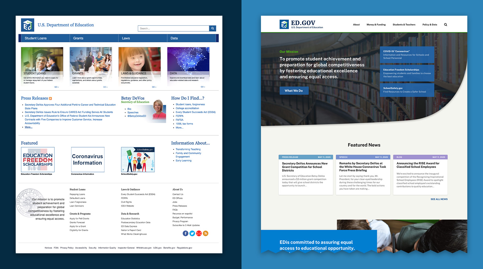
The last large-scale update of ED.gov occurred in 2015. This redesign reduced the number of homepage links and created more open space to make the site more user-friendly. While the update included several important changes, the design fell short in key areas including overall usability, navigation, a consistent brand feel and its heavy reliance on text. To achieve its goals and further its mission, the organization identified the need to keep pace with the way Americans learn, engage and interact. They issued a public competition seeking a complete redesign of their site to modernize the overall feel and branding and make their content more accessible to users.
By focusing on creating visual hierarchy, visual interest, and a major restructuring of navigation we were able to modernize the look and feel of the site while creating a more usable design to help user quickly access the resources they need without having to dig through several layers of content.

The U.S. Department of Education assists the president in executing his education policies for the nation and in implementing laws enacted by Congress. Their mission is to promote student achievement and preparation for global competitiveness by fostering educational excellence and ensuring equal access. ED.gov is the Department’s main public-facing website, with nearly 15 million users accessing the site in 2019 alone.

ED.gov had very little relevant information available from their homepage. The structure of the site was deep and chaotic making it very difficult to move in and out of interactions. We completely restructured their main navigation — creating a drop-down design that provides quick access to a much boarder scope of information. We included subheading within the menu to help funnel users to their individual use cases. Finally, we created a unique pop-out sub navigation to help ground users within the site when visiting deeper pages and helping them quickly access related content.
This design required finding a marriage of creating a fresh visual look while still complying with the U.S. Web Design System (USWDS) guidelines. We responded to this by creating visual interest on content heavy pages by incorporating strong hero images, color blocking techniques, exposed grids, iconography and subtle micro-interactions.


One of the key challenges the organization sought to address was the site's overall presentation and its overwhelming reliance on text. To provide more visual interest and break up the heavy blocks of copy, we used typography as a design element and introduced both hover states and dynamic navigation to make content easier to digest and navigate through.

ED.gov is an amazing hub of resources, but often links were listed without context causing user confusion. Our new design places all links within context to help users best find the information they need. Additionally, information restructuring and tab designs were utilized to reduce information overload and help users navigate to relevant content quickly.

Innovation means different things to different people. To a government organization, simply updating its contact methods means a resounding impact in communicating with users. Our design choices introduced innovation by setting up appropriate information funnels that enhanced usability.

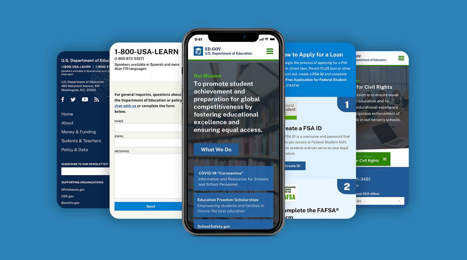
ED.gov is a content and information hub. Redesign concepts for the flagship site needed to be accessible for desktop, mobile and tablet users. Through the combined use of a Design System and flexible grid, we developed a mobile-friendly experience, with all content layouts using responsive design.